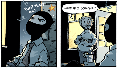
The final volume of Flight is out, folks, that being volume 8. I'm pretty excited that the book has finally hit the shelves as it's a damn good one. It's been an amazing opportunity being part of all this, and I can't thank Kazu enough for inviting me onboard way back in 2005. Although I'm sad to see the anthology series come to a close, I do feel it's time to push forwards and put our energy and skills to something new. We've all grown as artists and storytellers, yet most importantly we've made new friends. It's been an awesome journey, and I must thank the whole Flight family for the warm atmosphere, help and guidance. I'm forever in debt, fellas!
Speaking of the merry Flight folks, a bunch of us will be present in San Diego Comic-Con once again, at booth # 2235 (right between Marvel and Sideshow Collectibles). The turn-out will be massive with fellow artists coming from all over the globe, so come along and say hi! I'll be there as well, so I'm expecting to see a lot of Kenneth Shuri costumes in the Con. ;) Right? RIGHT?
My Flight peers have been posting their sketches and process pics on their blogs during the last few weeks, so I thought I'd tag along in the fun. So, for all it's worth, here's a little preview of how my contribution (Kenneth Shuri & the Wrong Kill) for the final volume came together:

I begin with fooling around with ideas, trying to get a hold of what I want to say/express with my story, and how I want to tell it. When the storyline starts to become clearer, I begin thumbnailing, doing little 2 x 3 cm pics of the pages. This part of the process helps me get somesort of visual idea of what will need to happen in the story, how it will need to be laid out and paced. Sometimes everything goes smoothly, but usually I end up doodling several thumbnails of the same pages in order to find a good flow, composition and etc. I usually write the dialogue and text next to the thumbs, so I get some perspective on what will be dealt with pictures/text.

I do recommend the thumbnailing part to everyone, as it is fast and efficient, and will give you an idea of how many pages your story will be, for starters. To me, the pacing of transitions and jokes is an important part of my storytelling, so pacing them out in the right spot is pretty much crucial. Thumbnailing helps me figure all this out.

When I have the story locked down, I begin sketching. I won't go into too much detail here, as I'm planning on maybe doing a tutorial of how I work later on. Since it's a Kenneth Shuri story, I thought you guys would probably like to see a fight scene. :) The page limit for Flight 8 was 20 pages this time around, so I needed to cut back on a lot of the fun part, but hopefully it's still interesting and flows well. I was raised up with old Harold Lloyd movies and WB cartoons, so I believe they have strongly influenced how I plan out KS action scenes. :) They're a blast to do, but sometimes a pain to figure out, as I try to layout the page so that the composition is both visually appealing and easy to read.

Here's a quick example of what I'm trying to describe here. Time stands still in the first panel, so it's very horizontal, static even. The small diagonal details, however, move (or should move) your eyes to the next panel. The blade's movement changes to speed lines in the third panel, creating a natural flow between the second and third panels. Ken's arm and pose pushes you forward to the next panel, and etc and etc (see what I did with the frying pan handle there?). Dunno if it's of any use, and mainly just a complete waste of my time, but I love thinking about all this stuff. Just hope it works and actually makes a difference. :D

The inking, in a way, is the boring part, since it's mostly just tracing. When the page is done, I scan it in and tweak about 90% of the page in Photoshop, after screwing most up most of the inking process. ;)

The next phase is colouring. With Kenneth Shuri & the Wrong Kill, I got help from my intern Tatu Hurme, who did the flatting for me. What that means, basically, is simply separating the outlines from the background, and then filling in all the basic colours in each panel, no shadows or highlights, just plain flat colours.

Tatu then sent the files back to me, and I continued with tweaking some of the values/hues, and adding the shadows, highlights and details. I usually do my speechbubbles by hand in the inking phase, but for Flight I've kept them separated. The bubbles and text were done in Illustrator afterwards.
But yeah, there you have it I guess, a very quick look into the stages. Like I said earlier, I've received some emails asking about my usual work process and etc, so I'm thinking of maybe parsing together a tutorial of some kind, if that'd be of any use to you. Let me know if you're still interested!
Anyhow, check out some of the other posts by other Flightsters such as Corey Godbey, Katie Shanahan, Scott C, Jake Parker, Der-Shing Helmer, Tony Cliff, Sonny Liew, Kostas K and Nicholas Kole! There's some mindblowing stuff there! But yeah, thanks for reading, hope you enjoyed it! Go fetch your copy of the last Flight volume, it's warmly recommended. Time to continue inking, though, there's still a whole lot to do before leaving for San Diego... :)
See you in SDCC, fellas!


